Working in Claude Code to fix broken image links in this blog.
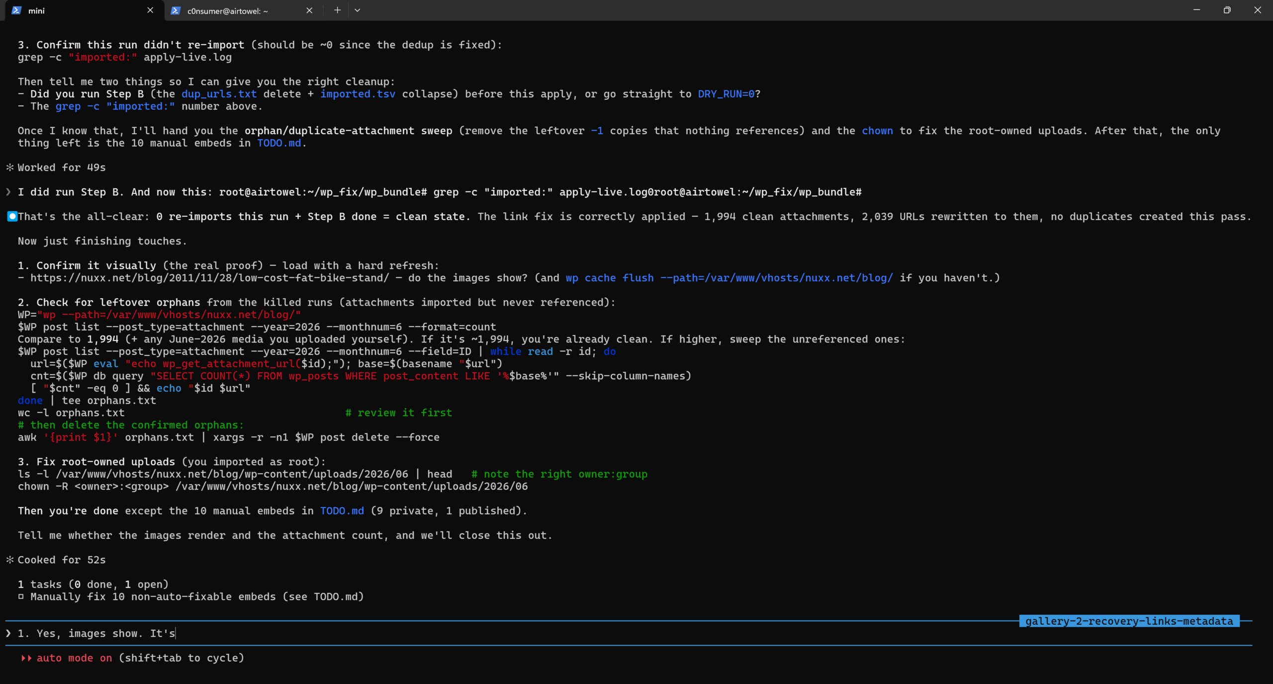
For all the potential problems that come with vibe coded stuff, generating/composing one-off fix-it scripts can be damned handy. For example, this blog got a big tune-up over the past day: almost 2000 embedded images have been unbroken.
For a lot of years I maintained a personal online photo gallery using Gallery2, but as it hadn’t been maintained since 2012, used a lot of server space, and had a very not-modern feel to it, I shut it down in mid-2020 and made a static archive that I just hosted at home. The biggest problem with doing so was that this blog had a lot of images hotlinked into there, so all those posts broke.
Fixing this manually was a pain, and while I kept a copy of the database+images around, somehow using that to fix things was a Big Task that I never started on.
Enter the modern world of AI-assisted coding and over the past few days of vacation, between riding bikes and walks and such, I prompted Claude to develop a solution. What it generated was a series of scripts that identified all posts containing images hotlinked to the old gallery location, found the related images, uploaded them into the Media Library, then edited each post to make it work.
That’s 1994 blog posts whose images have been restored; things like my Low-Cost Fat Bike Stand post are now working again.
This is where I find a ton of benefit to AI tools such as this: putting together the middle (the code) to fix up problems. If the inputs and desired outputs are known, and one can sanity check the system as it evolves, a lot can get done. And quickly. Tools like this have also been hugely beneficial at work, saving me absurd amounts of time with analyzing log files (eg: network captures, Process Monitor output) where I no longer have to timeline things myself.
I’m past the point where I’m surprised, but I’m still really impressed. This has been a long-standing back-of-my-mind problem/quirk with my site that I’d just sort of accepted… But here we are, it’s fixed. Yay!
This morning when checking my Capital One credit card statement I saw a surprise item, a CREDIT BALANCE REFUND for $56.58. After some digging I found this is what shows up when a card user received a check requesting a refund of a credit balance (balance owed to the card holder by Capital One).
Online support was of no help, so after speaking to a customer support (and holding) for over half an hour, I got an answer.
Whenever I go to pay to this credit card, I’m able to pay up to 10% over the current balance, which I tend to do because there’s almost always pending transactions, and it all evens out (returning to a normal balace) within a day or two.
If you have a negative balance, you have options to bring the balance back to $0. Keep in mind that in some situations this happens automatically.
Spend the negative balance: If you have a negative balance, use your credit card like you usually do, and Capital One will apply the account credit toward your purchases.
Get an automatic refund: Capital One will issue a refund if you don’t make any other purchases after two payment cycles. If you don’t use the money for up to four billing cycles, we’ll automatically send a refund check to the address on file. Note, your overpayment must be more than $1.
Request a refund: Capital One will mail your refund within 7 business days of your in-person or written request. Delivery usually occurs within 15 business days but may take longer depending on the mail carrier.
That is, if you don’t use the card for two payment cycles, and don’t spend the whole credit balance within four payment cycles, they’ll send a refund check.
Here’s where the flaw was triggered. Apparently I made an overpayment for the past two months right as the payment cycle was ending. Despite there being plenty of transactions during each billing cycle, and the balance wavering between a credit (from the overpayment) and debit (from normal use), because there was a credit at the end of a number of two consecutive billing cycles, it triggered a check issuance. This was confirmed by the customer support person I spoke with.
This appears to be a flaw in their business logic, with the result being a bit of money floating out there in the postal system for no real reason. It certainly cost Capital One money to issue the check, so it’s a waste of time (for me) and money (for them). As I write this I have $641.30 in pending transactions on this account, with ~$588 of that from the days before the Credit Balance Refund was issued, so sending a refund check is nothing but extra work.
I was hoping to send this to Capital One to share this finding with them, but they don’t have a public email address and I don’t feel like spending any more time on the phone, so I just wrote it up here. Maybe / hopefully the customer support person I was talking with (and their manager, with whom they had to consult on the issue) log it as an issue.
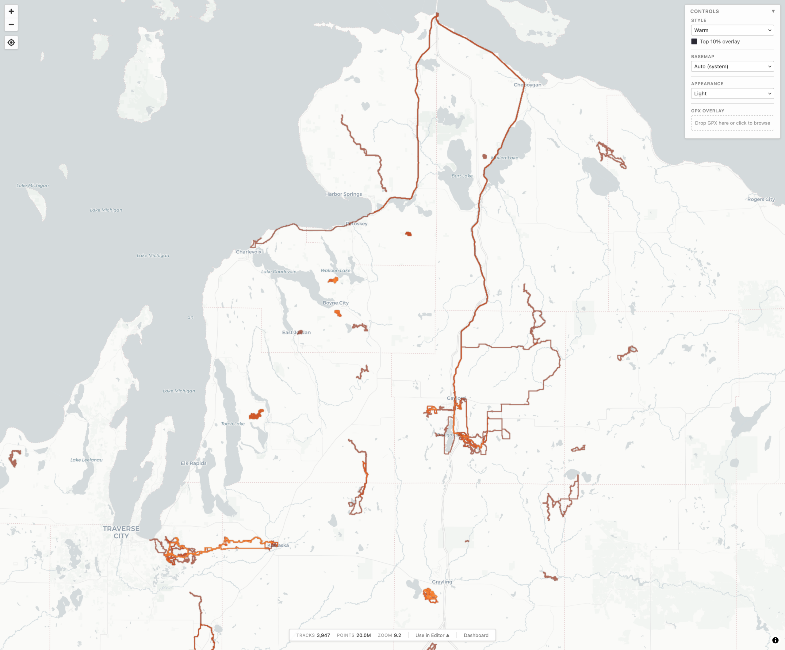
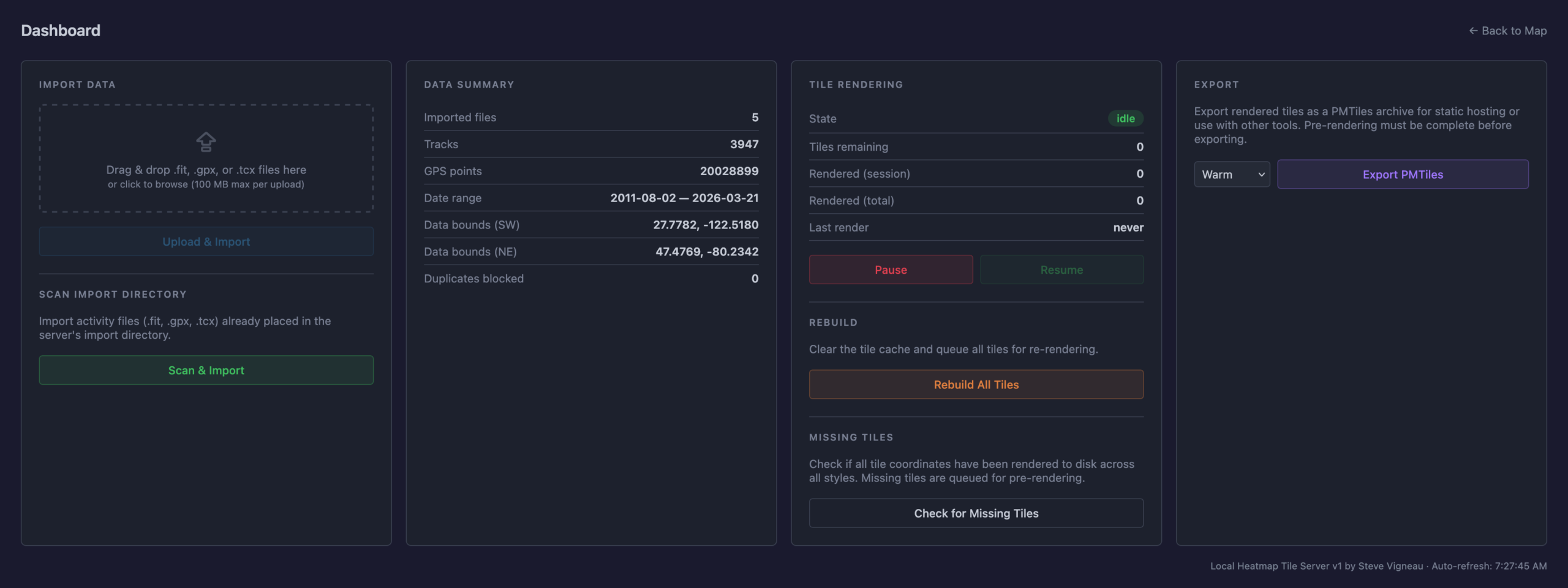
local-heatmap-tile-server v1 showing Northern Michigan in Warm style and Light appearance.
During a long drive to (and from) Florida, and a lot of thinking about maps, I realized something that I really wanted, and something that I could use AI-assisted development to experiment with: generating a heatmap from all my personal, archived activity files. Specifically, generating XYZ tiles, making them available via TMS (so they can be used as an imagery layer in JOSM), and also displaying them on a slippy map.
For years I’ve been using the Strava heatmap as a layer in JOSM for OpenStreetMap (OSM) editing and this works great, but I’m finding myself disconnecting from online social networks, including Strava, more and more. And while the Strava Global heatmap does work as a data layer with a free account, I began thinking about other options to use it, and other cloud providers, less and less. And yes, there’s similar offerings from RideWithGPS and whatnot, but I really wanted to generate my own since it’d give me a lot more flexibility.
So, for my next project working with Claude, I decided to try building a personal heatmap generation tool. And it worked.
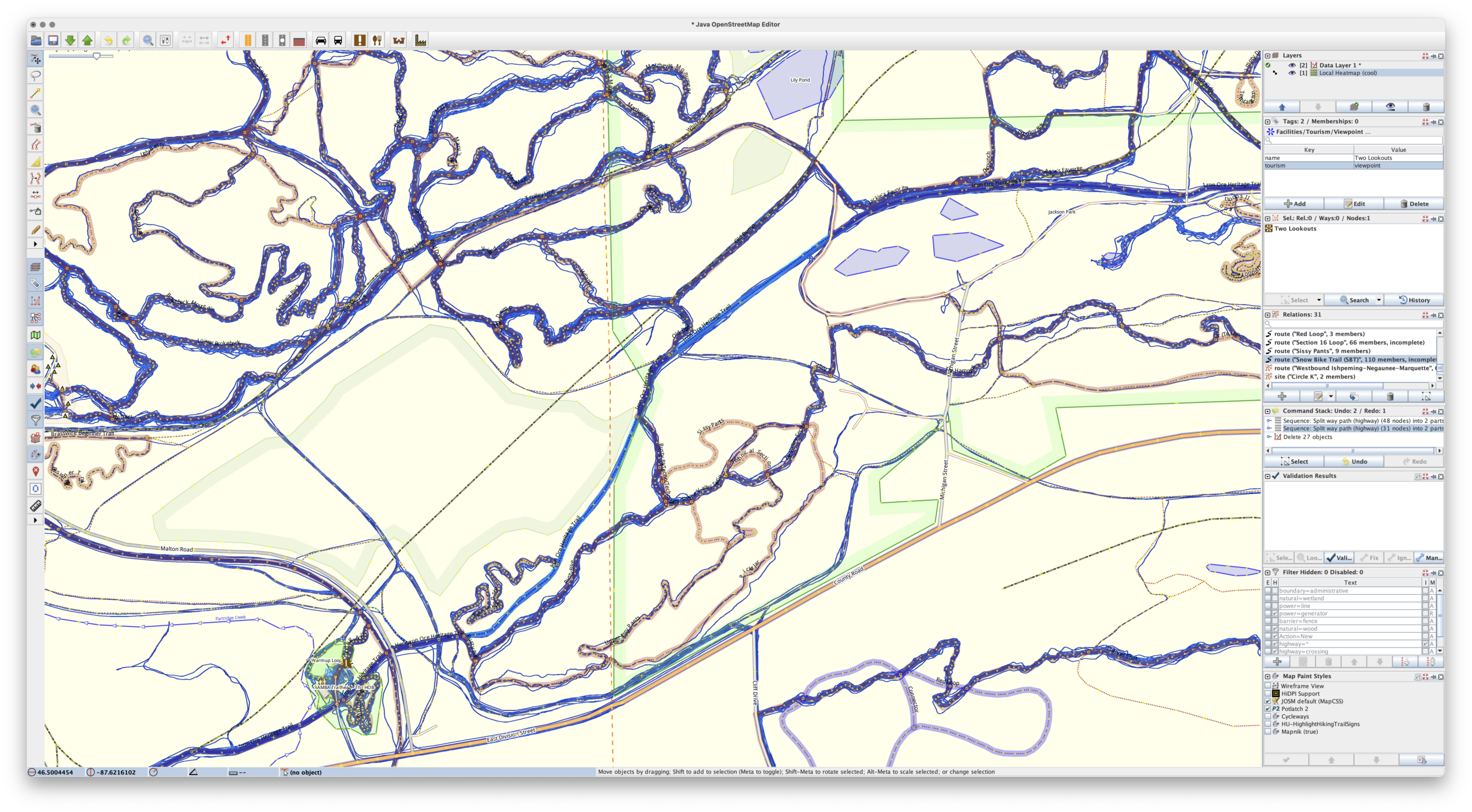
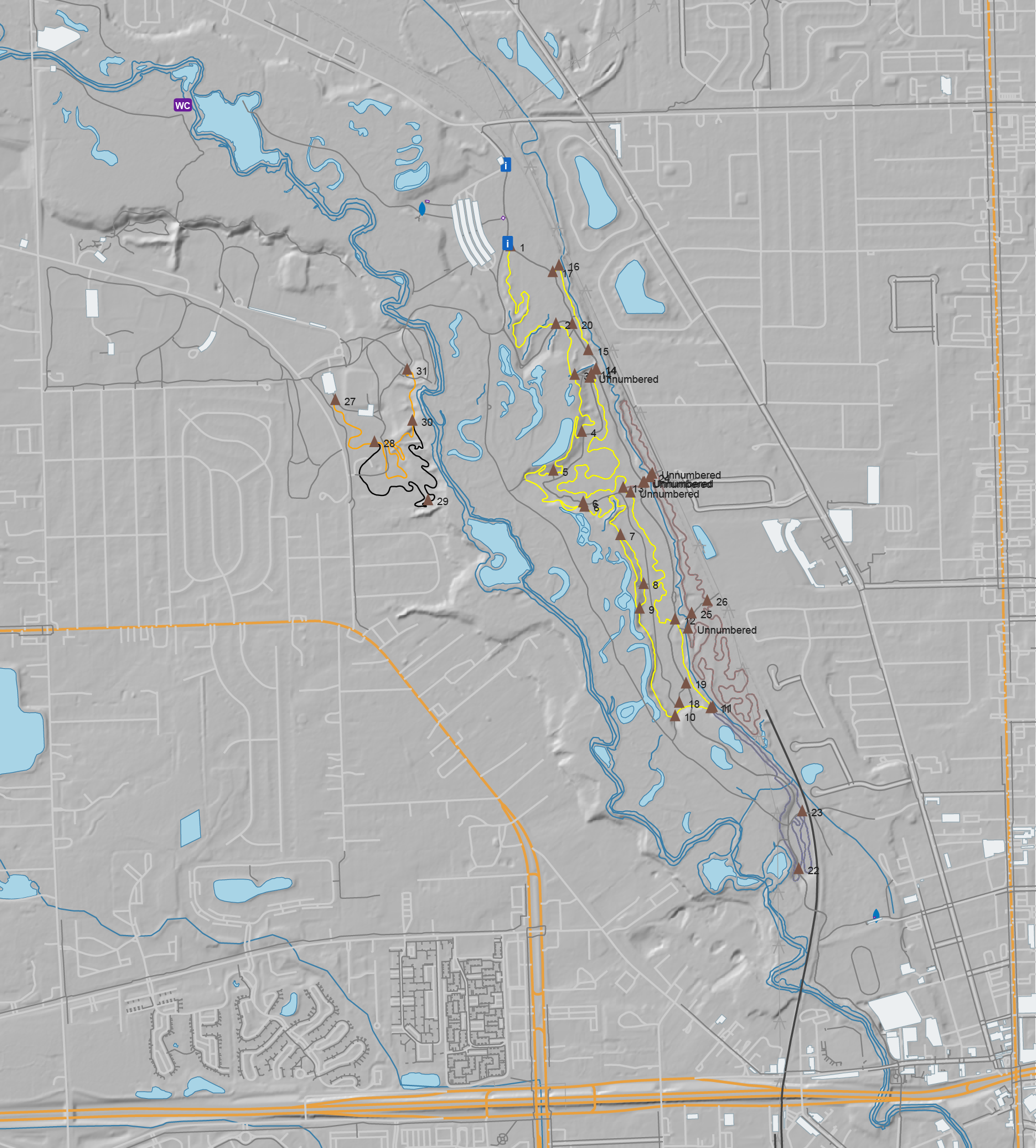
Cool heatmap of my ride and hike data, used as a layer in JOSM. (Ishpeming/Negaunee area.)
Using AI tools to develop software is nothing new, but I’ve never really been one to jump right on brand-new things, instead waiting for them to bake and show their utility before I dig in and use/learn them. I also find it very difficult to learn any tool or system unless I have a way to apply it. But when I do, getting my head around it comes pretty quickly.
In making this I’ve learned / found / finally-realized that with a known set of inputs, a desired output, an ability to identify/recognize bugs, and a task that’s known-possible, AI-assisted development saves can save incredible amount of time. Within reason it makes it possible for me to be more of a product manager than developer. Since I’m not really a developer (my career is in systems management and troubleshooting), that work for me is slow… and I’m not good at it.
Using Claude on the desktop to write the code, VS Code to read and make a few manual edits, and Docker Desktop so I could keep an eye on things, after about a week of free-time iterating, this is what I came up with, and I’m quite pleased:
This is a single Docker container that uses a bunch of Python to import GPS data files (.FIT, .GPX, .TCX), imports, deduplicates, and renders a complete set of XYZ tiles. It then makes them available via HTTP (for display in a slippy map or something like JOSM) or exports them to a PMTiles file for simple hosting. And it has a built-in slippy map viewer/data manager and a couple bundled viewers for completely static hosting (example).
Dashboard for importing new files, stats, and exporting the heatmap for static use.
The Python webserver, uvicorn, isn’t the fastest nor great at caching, so the XYZ tiles are fronted with nginx to very quickly serve them from disk, only passing the request back to uvicorn and the Python stack for rendering if the tile isn’t present. Once the tiles are rendered they are cached very quickly served up solely by nginx, to the point where panning and zooming freely is seamless. (And yes, you can pre-render all tiles for optimal performance.)
It’s been tested on ~4000 track single-GPX files (exported from rubiTrack), ~4000 .FIT files directly from Garmin devices, and a bunch of different types of single GPX files. And… it seems to work!
The file inputs (FIT, TCX, GPX) aren’t special and parsers have existed for a long time. Nothing about heatmaps is new. Tile rendering isn’t new. Tile serving isn’t new. Nor are web-based heatmaps from fitness tracker data. But it needed to be glued together to get something that works this way, and this type of development made it possible. And I learned something new about AI-assisted software development along the way. It’s sure an interesting new world with these tools.
And yes, beyond thinking about the features I had to do a lot of nudging along the way.
Some major bugs that were encountered were getting cross-tile heatmap brightness correct, missing cross-tile data, tiles not rendering properly when called via different ways, moving to a faster web server so panning the map felt smooth, and a whole lot of tweaking of brightness and line thickness and blur and such at different zoom levels so it’d feel nice to use, noticing and dealing with malformed XML in GPXs…
But this was nudging via prompts and having a bit of an idea what it was doing, not coding. Which is what’s so weird and new to me. It’s like directing a team of pretty-decent junior devs.
And the end result is something I’ve wanted for a while. And now it exists. (And no, none of this post was written by any AI tool.)
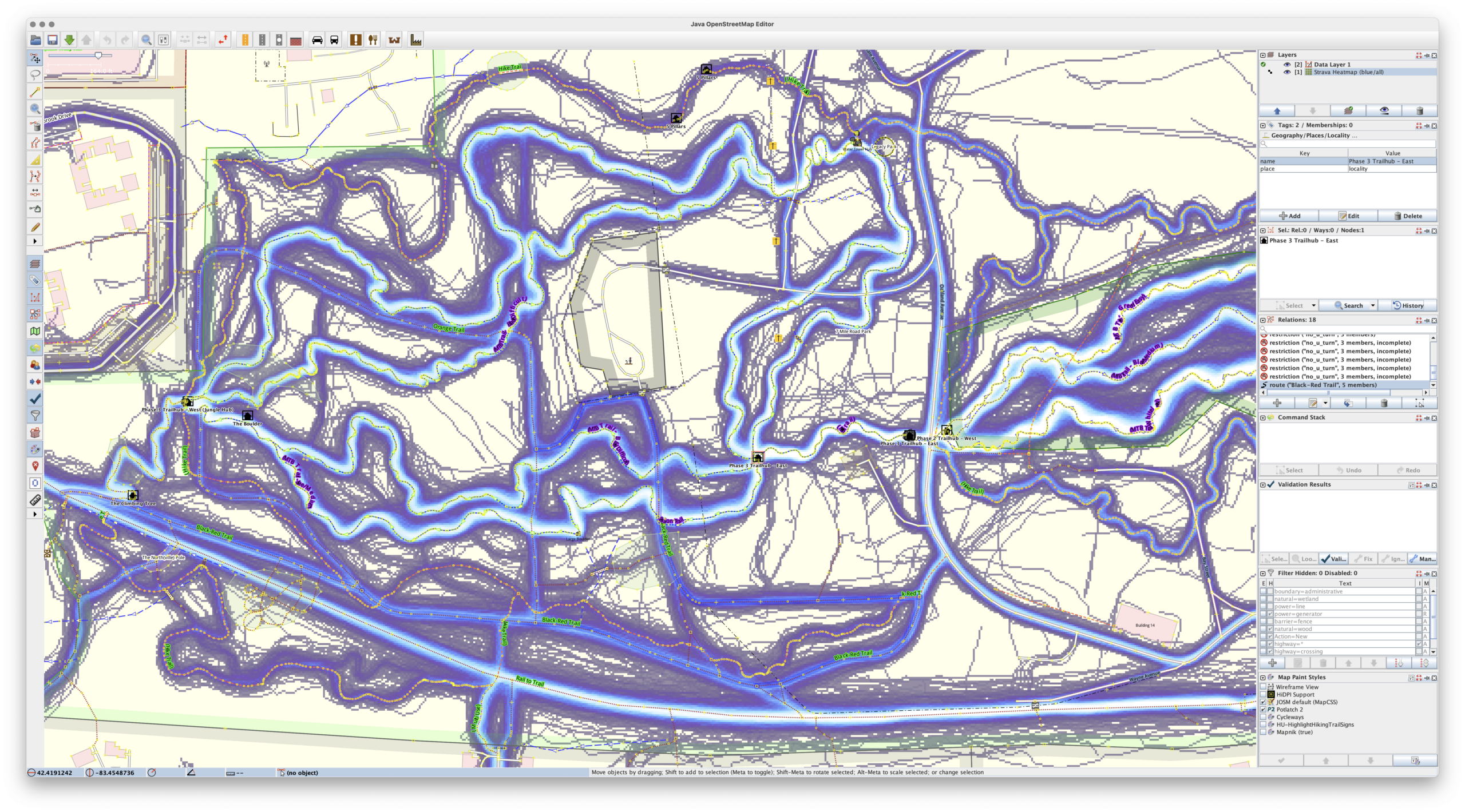
River Bends Park OSM data, with DEM hillshade layer, ready for Adobe Illustrator
After a bunch of years I’ve updated my MTB trail mapping workflow with a much-improved tool for getting OpenStreetMap (OSM) data into Adobe Illustrator. I’ve been experimenting with AI development tools, and I’ve been looking for projects, and this one fit the bill.
My old workflow used osm2ai.pl, a rather crude script (which I found years ago) that’d take an OSM file and turn it into vectors that I’d then group and style in Illustrator. While the tool claimed to filter objects into layers, I never got this working right, so there was a lot of manual work before I could begin styling the map. Each map took a couple of hours solely selecting, joining, grouping, and deleting stuff.
With some time on my hands during a mountain biking trip I began prompting Claude Code, via Visual Studio Code, for something similar: a tool which would take OSM data and make it usable in Illustrator. After a bit of back and forth I ended up with this: c0nsumer/osm_to_ai.
I very intentionally had Claude write everything on this, from the script to the readme, and it seems to have been a success. A bit of experience was gained, and I now have a tool that’ll read in OSM data (either exported from tools or queried live) and produce an Illustrator-compatible SVG that has trails grouped by OSM tag, colored, etc. All ready to finish up in Illustrator. It even has an extra layer of USGS 3DEP hillshade data, something I’ve wanted for years after seeing it on the Noquemanon Trails Network maps (but didn’t know how to do in Illustrator).
This was both a good exercise in using AI tools to assist in simple software development and helped streamline my mapping process. While I have a general discomfort with AI-developed code ending up with potentially uncertain output, this output is immediately validated visually, so it’s fine.
Unplanned, but on quick check this seems to have the side-effect of being compatible with Affinity Designer. While this wasn’t (yet) an intention, I’ve been looking for a good way to move away from Illustrator due to software cost (this is volunteer stuff, after all) but the old osm2ai.pl needed replacing before I could do that. This will make that possible.
So what next? Maybe I’ll see if I can make the PDF maps geospatial. This has long been a goal of mine, as it’d allow my maps to be opened in something like Avenza Maps and they’d show one’s actual location on the trail. But for now, I’ll start here.
As an overview, here’s the --help output to show what it can do:
(venv) PS C:\Users\svigneau\Desktop\OSMtoAI> python .\osm_to_ai.py --help
usage: osm_to_ai.py [-h] (--file PATH | --bbox BBOX | --overpass FILE) --output PATH [--width PX] [--dem PATH] [--fetch-dem] [--dem-resolution METERS] [--sun-azimuth DEGREES]
                    [--sun-altitude DEGREES] [--save-osm PATH]

Convert OSM data to an Adobe Illustrator-compatible layered SVG.

options:
  -h, --help            show this help message and exit
  --file PATH           .osm file to read
  --bbox BBOX           Bounding box: min_lon,min_lat,max_lon,max_lat
  --overpass FILE       File containing an Overpass QL query
  --output PATH         Output .svg file
  --width PX            SVG width in pixels (height is auto-calculated, default: 800)
  --dem PATH            GeoTIFF DEM file to generate a hillshade layer (any CRS)
  --fetch-dem           Download a USGS 3DEP DEM automatically and use it for hillshade. Saves a sidecar .tif next to --output for reuse.
  --dem-resolution METERS
                        Target DEM pixel size in metres for --fetch-dem (default: 3). Use 1 for lidar-quality where available, 3 for 1/9 arc-second, 10 for 1/3 arc-second.
  --sun-azimuth DEGREES
                        Sun azimuth in degrees clockwise from north (default: 315 = NW)
  --sun-altitude DEGREES
                        Sun altitude above horizon in degrees (default: 45)
  --save-osm PATH       Save the downloaded OSM XML to a file for later reuse with --file

Examples:
  python osm_to_ai.py --file mypark.osm --output mypark.svg
  python osm_to_ai.py --bbox "-71.12,42.36,-71.10,42.38" --output mypark.svg
  python osm_to_ai.py --overpass query.overpassql --output mypark.svg
  python osm_to_ai.py --file mypark.osm --dem elevation.tif --output mypark.svg
  python osm_to_ai.py --file mypark.osm --fetch-dem --output mypark.svg
  python osm_to_ai.py --file mypark.osm --fetch-dem --sun-azimuth 270 --sun-altitude 35 --output mypark.svg

(venv) PS C:\Users\svigneau\Desktop\OSMtoAI>
In our HA instance I have two helpers, each called Interior Lights, with one being a group of switches and the other a group of lights; both containing only things we’d consider interior lights. I then have an automation that turns both groups off, and trigger it from something like All Interior Lights Off which I’ll commonly trigger before going to bed, when leaving the house, etc.
Because a group entity can only hold the same type of entity, and we have lights that are both lights entities (i.e. bulbs) and switches entities (i.e. smart switches controlling dumb bulbs) we need one group for each type.
The specific problem was that two lights in the group group — one being an IKEA TRADFRI 800 lumen bulb and the other BTF-LIGHTING Zigbee single-color LED controller — started acting oddly. At first it was hard to tell what was going on, the IKEA bulb would seem to be on when not expected and the LED strip would be off when it should be on, but eventually I found repeatable cases:
When triggering All Interior Lights Off automation, if the IKEA bulb was already off, it’d turn on at minimum brightness.
After using All Interior Lights Off, the BTF-LIGHTING LEDs, on next on command, would flicker on and then almost immediately turn off.
It turns out the problem was having transition: 0 on the light group’s off automation. Back when doing tweaking for the Hue bulbs I changed this because otherwise these bulbs would dim out over 1-2 seconds instead of just turning off, and I didn’t like this. Unfortunately, this change exposed some bugs.
So I removed the transition from the automation and poof; no more weird problems.
Pick one of the files from the ZIP and let it load.
After it loads, go to Strava’s Global Heatmap, logging in if you need to. Then click the nine-box grid icon (same as the extension’s icon) that appears in the upper-right of the map.
Click Open in JOSM and the global heatmap will appear in JOSM.
To customize things a bit more — which helps quite a bit with visibility in JOSM — one can edit the map by picking a different activity and changing the gColor query in the address bar before opening in JOSM.
gColor options include hot, blue, purple, gray, andbluered. The activity can be changed via sport= and include the main Walk and Ride, and the lesser-used MoutainBikeRide, GravelRide, Snowshoe, etc.
But note that the extension doesn’t support all of these, so you may need to play with the URI in the new tab that opens to get things to display quite as you want. (I guess that’d be easy enough to change…)
UHMW PE replacement ring applied to a CS-M8100-12 cassette.
Stock Y0GX01500 on a CS-M8100-12 cassette.
Many Shimano cassettes, such as the CS-M8100 (XT, 12 speed) have a thin adhesive ring (part number Y0GX01500) on the back side, where it sits against the Microspline freehub body.
Unfortunately, these can easily be lost as they tend to stay on the freehub body when removing the cassette. Which is exactly what happened when I sent the NOBL wheels from my Mach 4 SL‘s in for a warranty rim replacement. Some folks advocate for removing them, believing them to cause cassette wobble, but the main purpose seems to be eliminating noise and fretting between the cassette and freehub bodies.
Since I don’t like bike noises, I wanted another. They can be bought online for something like $9/ea before shipping, but that seems like a lot… So a better solution? Make one!
37mm x 33mm ring cut from UHMW PE on a Cricut.
Measuring a new ring on a spare cassette showed it to be 37mm OD x 33m ID, roughly 0.2mm thick. I have some 0.0115″ / ~0.29mm (Ultra High Molecular Weight Polyethylene (UHMW PE) tape from McMaster-Carr (part 76445A764) that I use for rub on bike frames, so that seems perfect. Kristen cut a ring out with her Cricut (with a Deep Point Blade, set to “thin cardboard”), I stuck it to the cassette, and that was that. Much better than spending $9 and waiting for it to arrive.
I had originally tried to print one with PETG filament, but when the first of two broke coming off the build plate I figured it probably wasn’t the right material and would come apart under load, leading to a loose cassette, noise, etc. UHMW PE tape is very malleable and often used to stop noise between rubbing parts, so it seemed like the better choice.
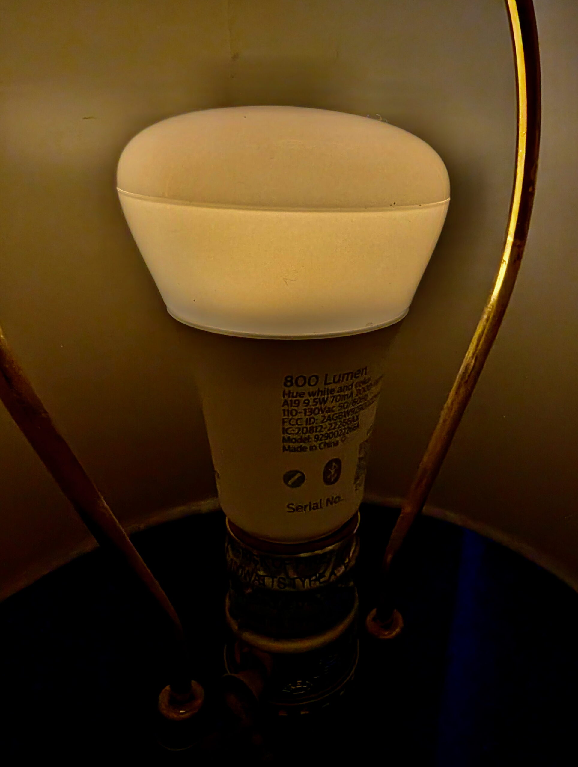
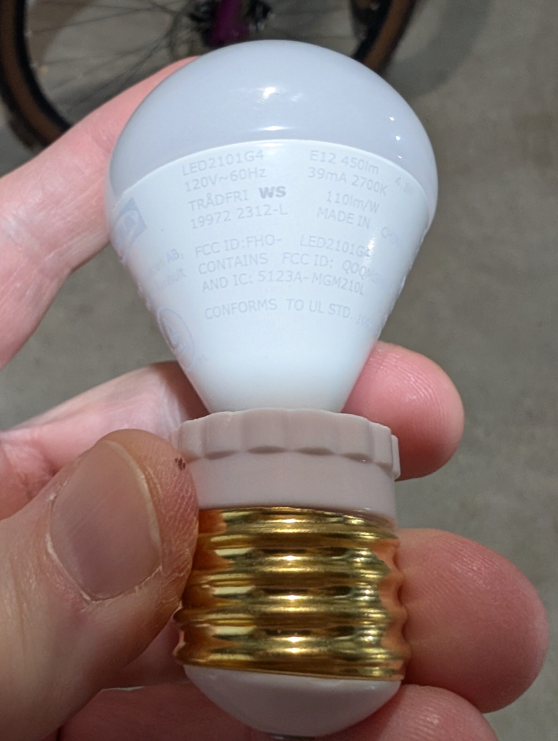
In continuing to optimize things I wanted a bulb that has an even-dimmer and warmer initial brightness than the IKEA TRADFRI LED2101G4 (in an E26 to E12 adapter) I’ve been using. I’ve now settled on Philips Hue White and Ambience 60W A19, as it’s both lower brightness and warmer at initial turn-on and has a brighter high end, making it more usable when working on things around the bedroom.
With the Lighten Up! I had used a halogen bulb, which combined with the dimmer, made the initial brightness so low the filament was barely visible with the naked eye. This made the initial-on not noticeable and didn’t jar me awake. To try and replicate something similar I considered the Shelly Dimmer 2 and putting a halogen bulb back in place, but I wasn’t really wanting to go back to bulbs that give off so much heat and use so much power. And while I find Shelly devices well engineered, I wasn’t very interested in more WiFi IoT devices. (I really prefer Zigbee or Z-Wave for security reasons.)
Thanks to this /r/homeassistant thread I was prompted to try some Hue bulbs, so $76.31 to Amazon later and I had a pair. They easily adopted directly into HA and after a little tweaking (mostly adjusting automations for the new devices), I’m happy with them. The warm/low setting is really quiet dim and yellow-reddish, and at full brightness it’s… nicely bright.
I may tweak the curve used for bringing the brightness up, but thankfully the script I use (Ashley’s Light Fader 2.01) has a whole range of curves available. I’m currently using the default easeInSine, but this morning it seemed to hit the final brightness a bit abruptly, so I may try something like easeInOutSine.
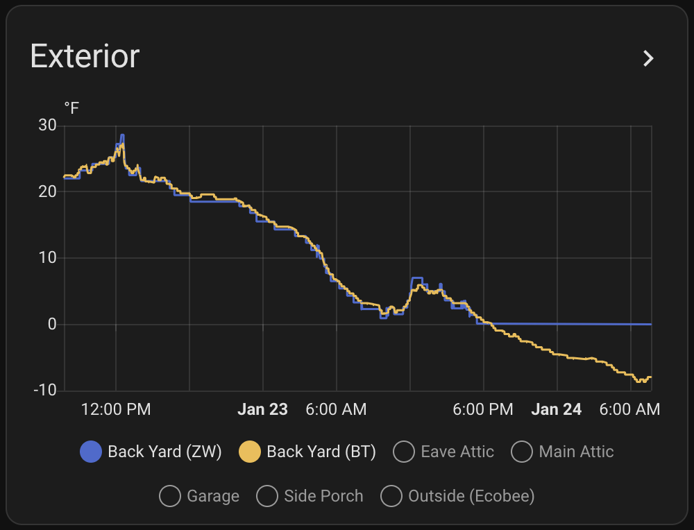
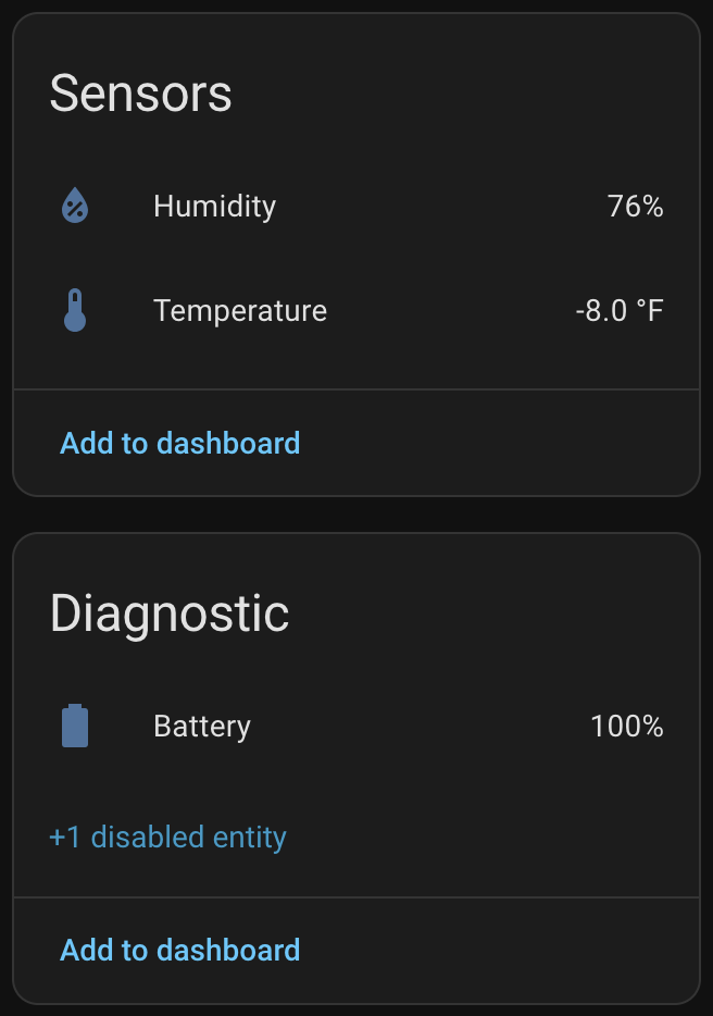
SwitchBot sensor showing well-below-0°F reading and still 100% battery after a month of winter.
At ~US$31 for a three pack (via Amazon) they are 1/3 the price of the ZSE44, take AAA batteries, and are IP65 rated. The specs also claim they work down to -40°C (-40°F) with Lithium batteries. Basically perfect for outdoor spaces including attics, crawl spaces, etc.
I installed this side by side with the ZSE44 with the solar radiation shield on the back fence, and as hoped, it’s reading well below zero and working fine. I also put the other two (from the three pack) in the fridge and freezer to see how they’d do there, and while the freezer doesn’t get as cold as it currently is outside, it was a good preview of data before the temperatures dropped. And all three currently are at 100% battery.
Now that we’ve had our first well below 0°F temperatures of the season I can say that yes, the SwitchBot sensor is working properly, with more frequent updates.
When initially setting up Home Assistant its purpose was to log temperature and humidity at various points around the house. I started with the cheapest sensors available at the time — Aquara Temperature and Humidity Sensor — but after a couple years have passed I’m finding these a bit disappointing. The CR2032 battery life isn’t great (even indoors they last about 8 months), and I’ve had a few of them just die. While they are small, the size benefits don’t outweigh the battery and longevity hassles. The Zigbee connectivity is pretty simple and mostly works, but when the battery or device dies it just kinda… falls off the network and works/rejoins (even after a battery swap) unreliably. I think I’ve disposed of three in the last year.
The biggest downside to these SwitchBot sensors is they use Bluetooth Low Energy (BTLE) for communication. This does not have nearly the range of Z-Wave, which was my original reason for putting the ZSE44 in the back yard.
Thankfully Home Assistant can use Bluetooth Proxies (networked remote BT sensors), and the Shelly 1 — a UL-listed WiFi-controlled smart relay — is one. I already had a few of these around the house to control lights fixtures, so via the proxies I’m able to get enough BTLE coverage to pick up the sensor along the back fence and the ones in the fridge. It’s no Zigbee or Z-Wave or Thread-like self-healing mesh, but so far it’s working well. And really, with the devices’ fixed locations, there’s not a ton of practical difference between setting up a mesh network with well-planned routers (Zigbee) or repeaters (Z-Wave) and deploying BTLE proxies.
I’ve also picked up two of the SwitchBot Meter Plus devices which is a temperature/humidity sensor with an LCD display that runs off of two AAA batteries. It’s not as robust as the Indoor/Outdoor sensors, but is perfect for somewhere I want to see the local temperature visually and log it in Home Assistant; indoor uses. In years past I’d place temperature/humidity displays like this around the house so I could see some data, and these are basically the same, except with logging to Home Assistant.
Long-term, as they fail, I could see myself replacing the remaining Aquara sensors around the house with these. Even the couple of ZSE44 sensors I have may get replaced with these (particularly the one in the back yard). But, for now, I’m just glad to know how far below 0° it really is, and have record of this, because data is nifty.
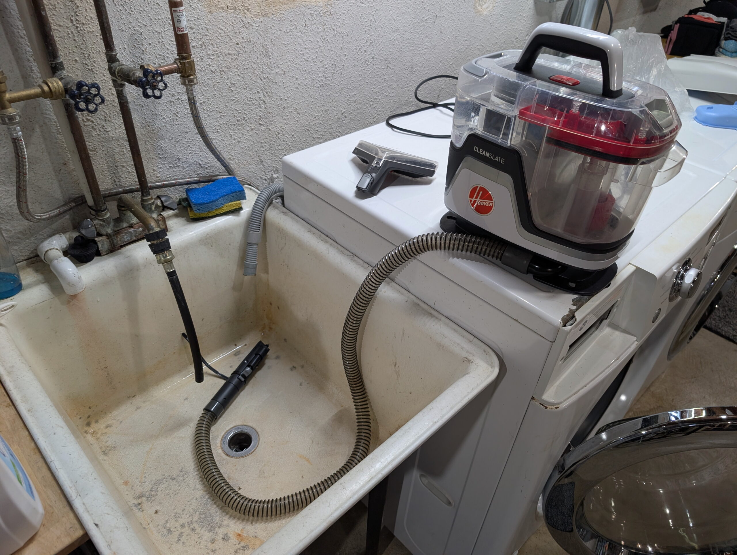
Hoover CleanSlate sprayer being primed after it’d dried out.
We have a Hoover CleanSlate portable vacuum thing and it’s incredibly useful for cleaning up small spills / stains / cat vomit / etc. This morning when I wanted to use it the sprayer was no longer working.
It had worked last time, and I’m judicious about letting it dry out between uses (because I don’t like mold), and it turned out this dried out the pump which in turn meant it needed some time to self-prime before it’d spray.
The solution was simple: put a releasable cable tie around the sprayer handle, put that in the laundry tub, and let the unit run for a few minutes. After this it was spraying fine and all was good. (Yes, you could hold down the trigger, but I’m lazy. And I wanted to make a cup of tea.)
(This is part of my neo-Luddite series where I document things in writing. Because I find a watching a multi-minute YouTube video to access info that can be acquired via a few paragraphs of text to be maddening.)


